Formal Introduction
to mintRedmine
WRITTEN BY
This Thursday, 20th Feb 2014, we will launch mintRedmine, our new mobile application for Android.
Before we finish our final stage, I want to take some time to introduce every detail of our application.
Full Functionality
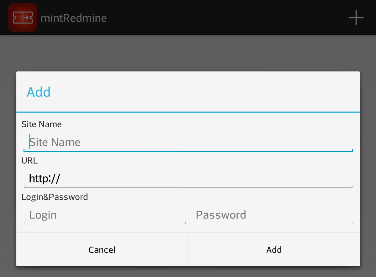
When we started to make an app for Redmine, the first mission was to make it complete for basic usage because if we need to resort to the Redmine webpage, then, we need to switch from our app to the webpage frequently, and that would make our app useless in the end. So, we collected use cases for routine tasks, and then we tried to make it so that they could be done without leaving our app.
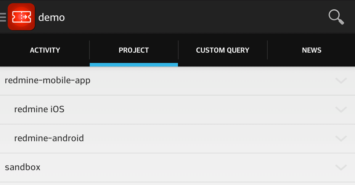
We used Redmine’s API wherever possible, but if the API did not support what we needed, then we parsed the webpage’s HTML. But we did not want to parse every webpage because there would be a risk of not working after Redmine’s upgrade. So, we tried our best to stick to the API, unless other features were absolutely necessary.
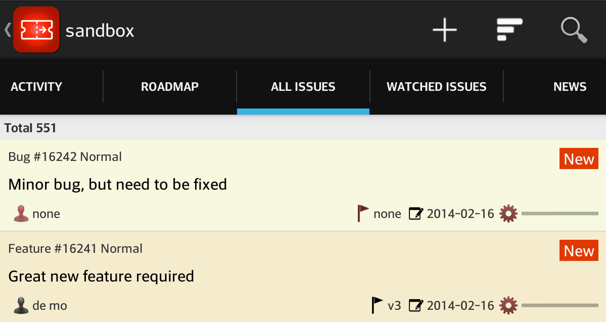
And also we made our app look similar to the Redmine webpage. So, people who have used the webpage before, can use our app without having to relearn how to use it.
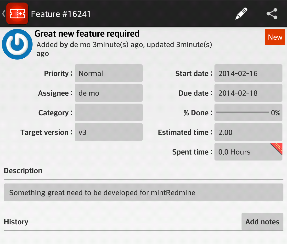
And we did not make any custom UI components. We only used standard UI components. So, Android users can feel at home.
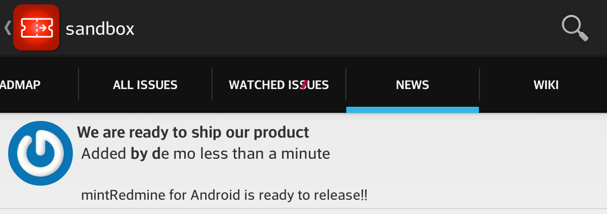
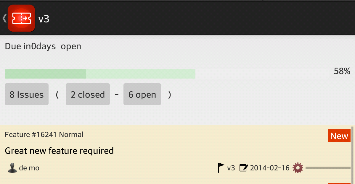
It contains Activity, Roadmap, Issue List, Watched List, News, and Wiki Page tabs for each project. And for every site, there are Activity, Projects List, Query List and News tabs.

Textile / Wiki
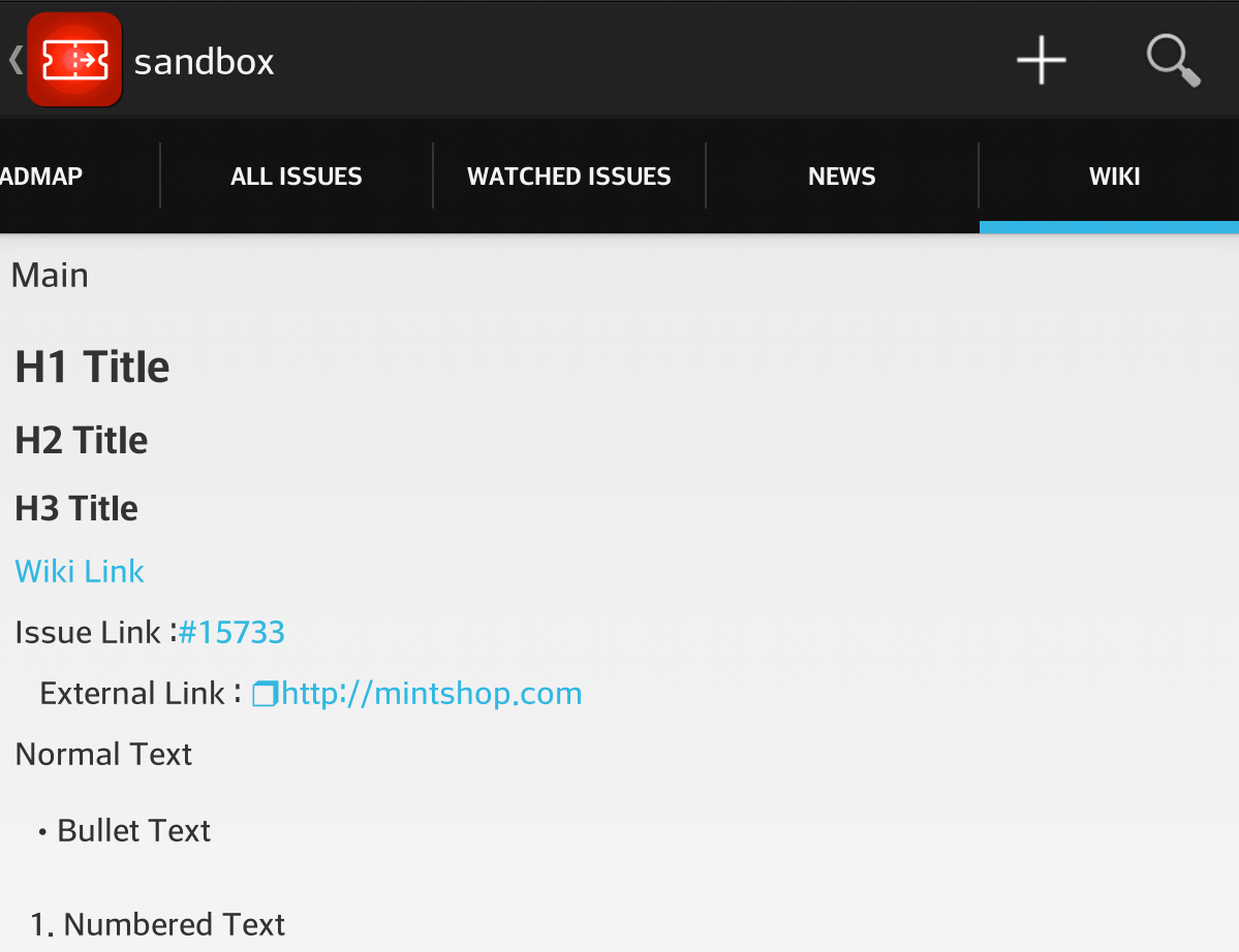
It was not very hard to show project and issue information on our app. But, the problem was that all the content of the issue is written in textile format. So, if it showed its content as in its raw format, then I felt I did not want to use it. So, we decided to tackle this in a little bit harder way. We tried to convert textile format to styled text.
We developed a textile parser by ourselves. It is not perfect yet. (It does not support table format) But it supports most of its syntax, so the description and history of an issue look just the same as the webpage. We applied it to the wiki pages, so we can move from the issue pages to the wiki pages without leaving our app.
Custom Query Support(with Grouping/Search)
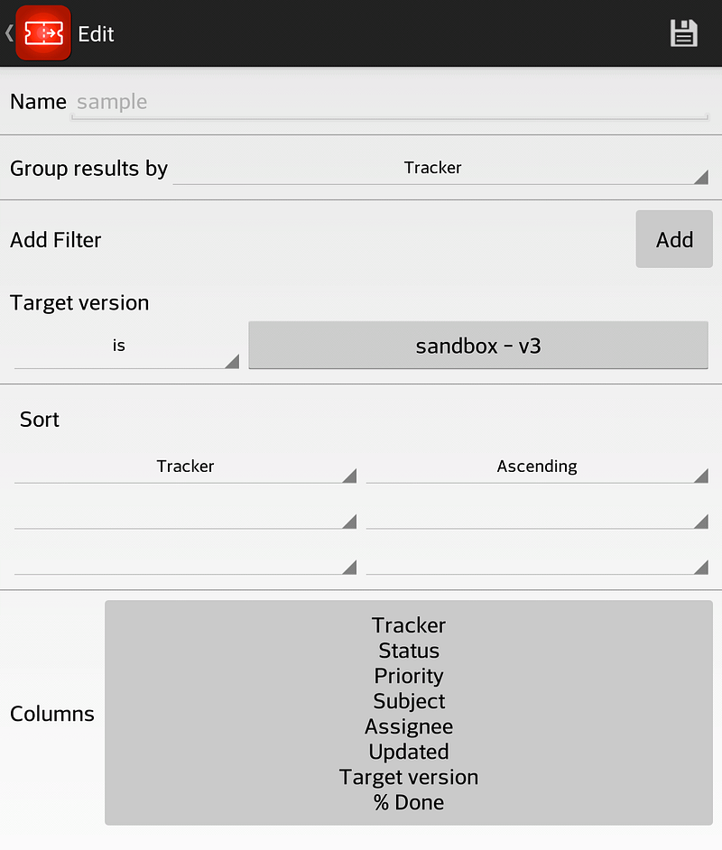
When we first made our app, it was very hard to find a specific issue. Redmine webpage itself is very notorious for its issue listing. But, it has a very powerful Query system instead. So, with the help of queries, users of Redmine can easily find any issue they want.
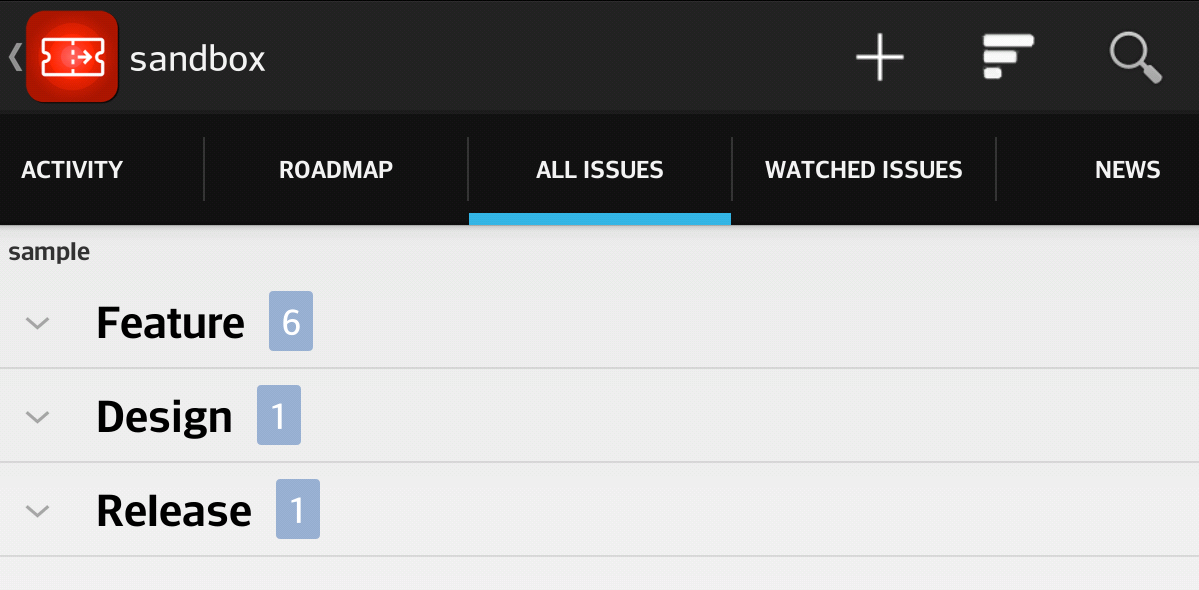
So, naturally, we brought this Query into our app. Our app can use the Query you created on the webpage, so it shows the same list as the webpage. And it also shows the list in a grouped format (and I’m very proud of this feature).
You can also make your own custom query on our app. (But this query can not be saved on the server) You can create a query the same as you do on the webpage.
Issue Creation/Update
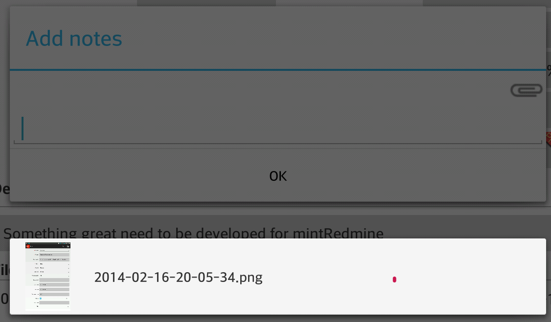
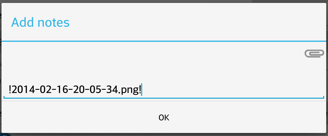
After we were very happy with issue browsing and searching, we shifted our focus to issue creation. The first thing we wanted was to add notes to the issues. And because we were making a mobile application, we wanted to take a snapshot of the screen and upload it to the system. So, we created a system that supports file upload. But, when we uploaded a picture and put the picture file name into the note, it was very hard to remember the name of the picture. So, we put the uploaded image selection box into the note area, and it became very easy to insert an image tag into the note.
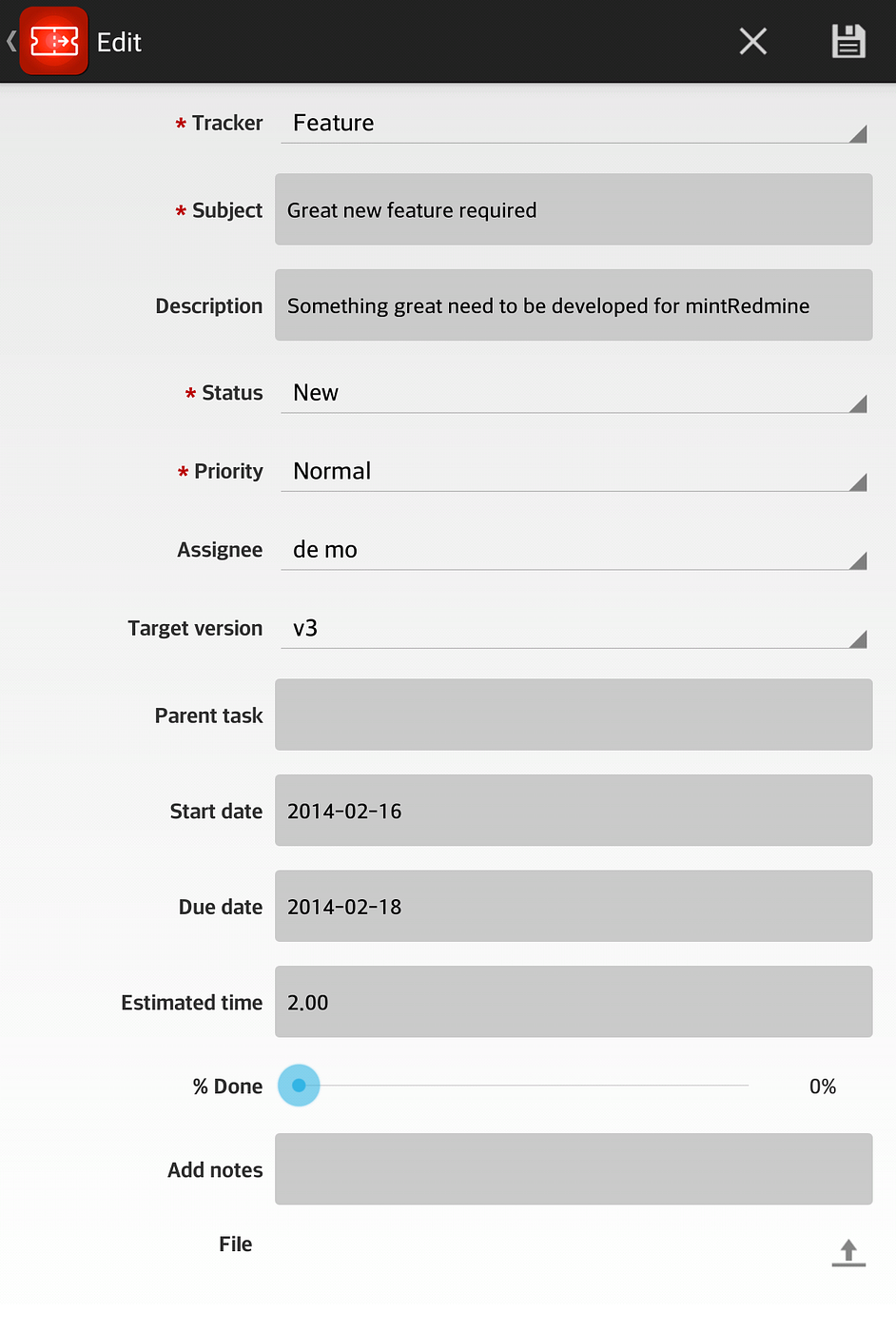
Moreover, we created an issue creation and update feature. You can create an issue with every field. And also, it supports custom fields.
Quick change
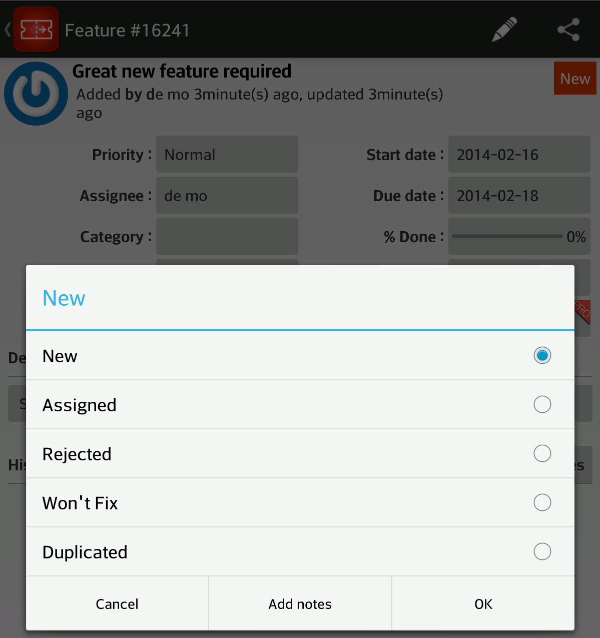
With time we realized that we were only changing one field of the issue quite often. So, we turned every field on the issue page into a button, so if you touch the button of one field, then you can change that field value only. We found that this feature was very convenient.
Activity / Notification
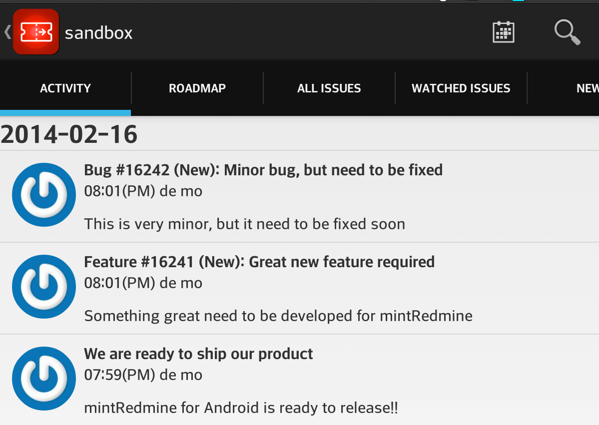
We wanted to make our app useful not only on the road, but also beside our computer. At this time, we want our app to be a second display of the Redmine webpage.

It fetches the Activity feed every 5 minutes and shows it on the app screen. It also shows a popup display of notifications when we are viewing other pages.
In addition, we wanted to implement some kind of push notification for Redmine. But, this required server modification. So, we used the Activity feed to simulate push notification. When you are not using the app, and there is new activity in the feeds, then it can be configured to notify you.
Widget
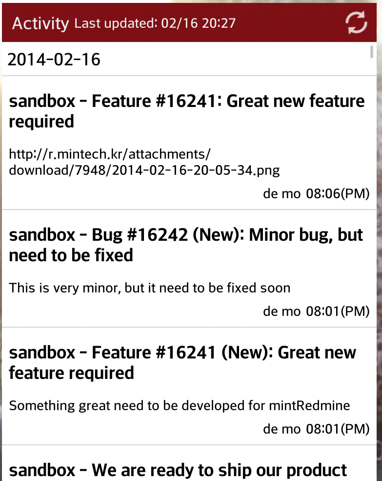
Because it is an Android application, we wanted to support Android-specific features. But we didn’t want to overdo it. The widget was the very thing we were looking for.
It was a very good solution for Activity viewing.
Time Tracking
When I first wanted to make an application for Redmine, a Time-Tracking feature was the first thing I wanted to make. It was very hard to measure the time I spent on a specific issue. So, I needed an app to count time for me.
So, we attached a Time-Tracking feature to our app. We labeled it as a Pro feature. We did it not because it is very sophisticated or very hard to implement. We didn’t want our app to be completely free. We didn’t want donations. We wanted to make a commercial app. We wanted to make money from this app. At the same time, we didn’t want to make the mistake of annoying our users for monetization reasons. So, this is our tiny banner saying that this app is not totally free, and you need to pay money for full usage. Of course we have plenty of plans for future features for the Pro version.
Custom Font Setting
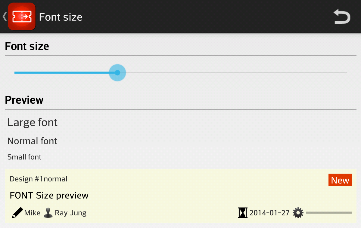
Because this is an Android application, it will need to run on many different kinds of devices. We tried our best to make our app look pretty neat on every device, but it was slightly bigger or smaller on each device. And every person had different preferences.
So, we created custom font-size settings to allow users to change the font size, so they can adjust the view they want.
Issue List with Custom color
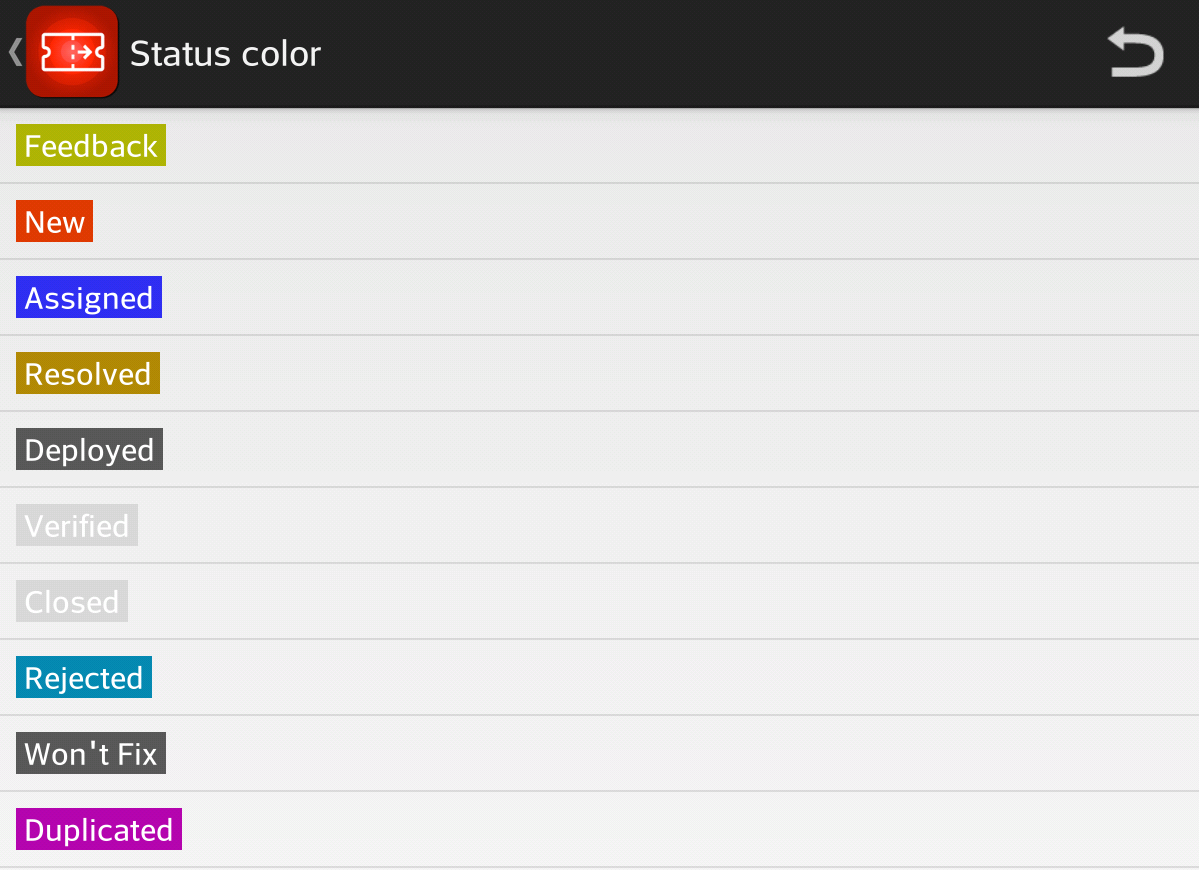
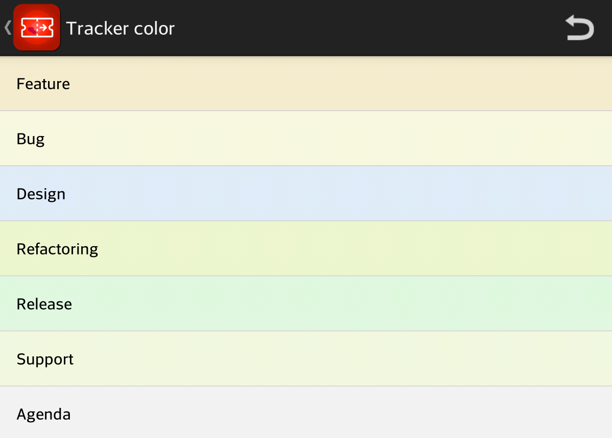
Even though we support custom queries when we are browsing the list of issues, it was not comfortable for skimming through issues.
So, we added custom color schemes for Statuses and Trackers. Users can choose their favorite color for each status and tracker, so they can easily pick out an issue with the specific status or tracker they are searching for.
